Thursday, 29 April 2010

Final Charity Website

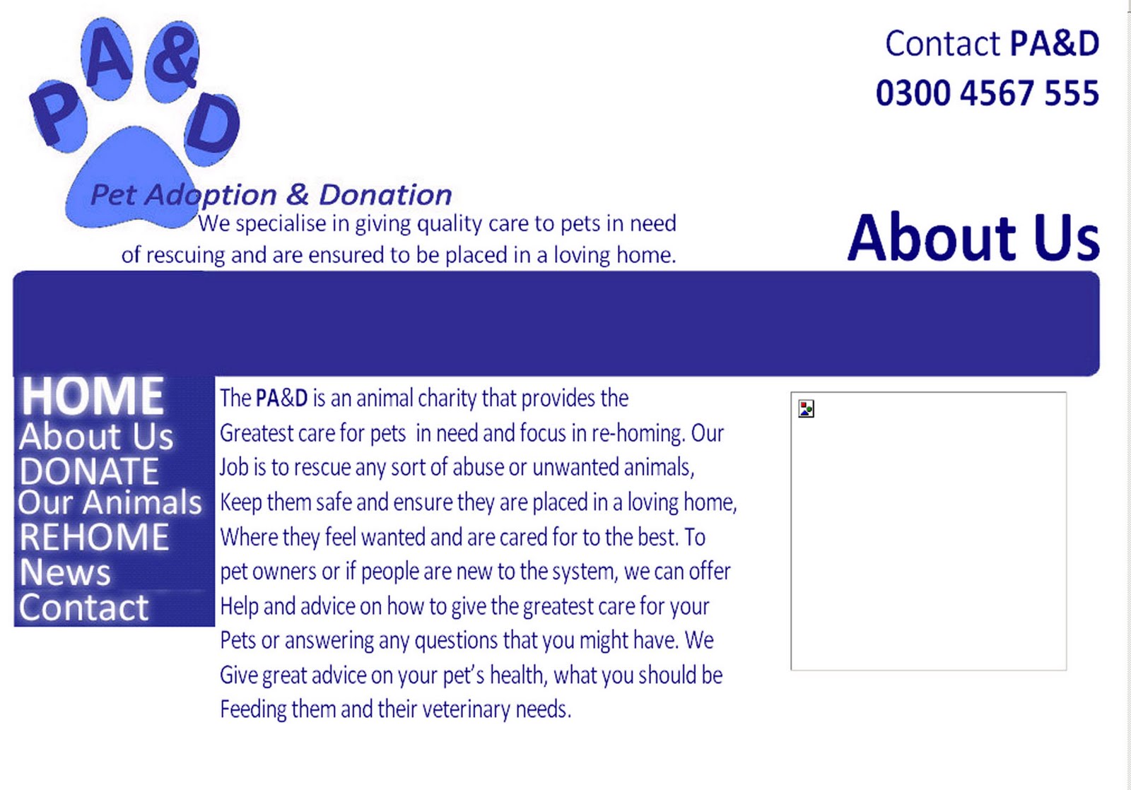
In order to create my charity website I used a software called, 'Serif WebPlus10'. I was able to insert my own photographs, a video, hyper links, logo, a navigation bar and text. These could either follow web page conventions or break them. I chose to follow the web page conventions to make it clear for my audience to navigate around my website. Below are my final screen grab shots of my charity website. Each page displays the logo, contact helpline and the navigation bar. It also displays the title of the page to make it clear for the audience what page they're on.
-------------------------------------------------------------------------------------------------------
Home Page
-------------------------------------------------------------------------------------------------------
The home page includes original photographs of animals relating to the charity website. The navigation bar is clear and easy to use. There is a little it about what the website involves such as the, "Looking for a pet?", "Fundraising for the PA&D", "Our animals" and "The PA&D Today".
-------------------------------------------------------------------------------------------------------
About Us Page
-------------------------------------------------------------------------------------------------------The about us page includes a whole, welcoming text about the charity of issue and also a video about what the charity does.
-------------------------------------------------------------------------------------------------------
Donate Page
-------------------------------------------------------------------------------------------------------The donate page includes information about donating for the PA&D and main points on how to do that. I also have included a photograph of one of the animals to make the page more exciting not just boring and plain and full of text.
-------------------------------------------------------------------------------------------------------
Our Animals Page
-------------------------------------------------------------------------------------------------------
The our animals page displays just some of the animals that are from the charity. I have displayed their names and a photograph of them. This could have more of an effect on the audience actually seeing the poor animals who have been treated so badly.
-------------------------------------------------------------------------------------------------------
Rehome Page
-------------------------------------------------------------------------------------------------------
The re-home page includes a lot of information about re-homing. There is a hyper link which I have created to able the audience to get more information from just clicking on the highlighted, underlined text. "Click here". This makes it easier to navigate around and enter a new website from just one click and to get more information.
-------------------------------------------------------------------------------------------------------
News Page
-------------------------------------------------------------------------------------------------------
The news page shows latest news and photo's of the PA&D's and stories. More photographs make the page more interesting and will be effective for the target audience.
-------------------------------------------------------------------------------------------------------
Contact Page
-------------------------------------------------------------------------------------------------------

The contact page gives all the information on how to contact the charity. It is a bold and big piece of text to show its importance.

The colours of my website are suitable for a animal charity website. Most animal welfare charity websites which I researched in use the colour blue for their logo and layout. My layout is clear and displays the logo, title, contact helpline and navigation bar on every page. The colours connect to the colour theory under analog colours. The blue's which are used are either side one a little darker than the other and analog colours are known to be used when nature is involved or harmonious. As it is to do with animal I feel it is appropriate. The connotation of blue gives a calm atmosphere instead of red meaning danger for example.

Wednesday, 28 April 2010

Construction Process for My Charity Website

-------------------------------------------------------------------------------------------------------------
Dimensions
-------------------------------------------------------------------------------------------------------------


In order to start creating my charity website I had to set the dimensions to a certain width. I inseted a website template like the one above to work off as a background so no objects such as; text, photographs go under the template. This would mean that the audience would have to scroll down to see anymore information so it was essential that all the important object were within the template.

-------------------------------------------------------------------------------------------------------------
Navigation Bar
-------------------------------------------------------------------------------------------------------------


I had a task of creating my own navigation bar, I did this on the program 'Adobe Photoshop'. As I was new to this program and unexperienced on all the tools, I was able to follow simple instructions to create my navigation bar. Firstly I used the shape tool to draw out a rectangle shape as my main background of my naviagtion bar. Next, I added text using the text tool onto my naigation bar, I was able to change the font and colour. I inserted the names of my pages which I wanted to appear on my website. I chose a font that was clear and easy to read and a suitable colour to read off a dark background. I chose white and blue as I feel they work well together. Next, I added an effect to my text, I used the effect blur. Adding this effect made the naviagtion bar look more stylish and clear for my audience. To insert my navigation bar onto my website I went to insert, web object and clicked on rollover as you can see in the above image. The box above then appeared. I ticked both boxes normal and over as I had a second layer with the blurred effect on my text. I browsed for my sepearate parts of navigation bar and put them all together to make my navigation bar. To make the naviagtion bar navigate around my website I had to add a thing called an anchor to the page and connect it to the naviagtion bar. This then abled the naviagtion bar to work and made it easy to navigate around the website.
-------------------------------------------------------------------------------------------------------------
Logo
-------------------------------------------------------------------------------------------------------------
I created my own logo, from using my designs and producing it on Adobe Photoshop. I used the shape tool and created it using a paw print shape relating to the animal charity website and added text to it with the text tool. I changed the colours then my logo was completed to insert into my website. Inserting the logo was simple, just went to insert picture, from file and browsed for my logo and moved into appropriate place (the top left side of the screen) following the conventions of website making.
-------------------------------------------------------------------------------------------------------------
Photographs
-------------------------------------------------------------------------------------------------------------

I took my own original photographs of animals (cats, dogs, rabbits mainly) to use to put on my charity website. To insert my photos all I had to do was go to insert picture, from file and browse for the photo to insert and place it in a suitable place within the website template because they are eye-catching for the audience. I was aiming for my layout to look professional and serious.
-------------------------------------------------------------------------------------------------------------
Video
-------------------------------------------------------------------------------------------------------------


In order to produce my video for my charity website I used the program, 'Windows Movie Maker'. This was a simple enough program to use as on the left side of the screen it gave me information on what to do. I inserted my own photographs and added some text and the charities logo. It was put all into a sequence and was timed reasonably well. I was able to add transitions to the movie and the edit faded from one photo to another. To insert my video onto my website I went to insert, media and then video. I was able to browse for my video set it as an icon to show up on my about us page. Above is a preview of my video for my charity website.
-------------------------------------------------------------------------------------------------------------
Text
-------------------------------------------------------------------------------------------------------------
On this software there was a text tool to insert text and write plenty of information for my website. I could change the colour of the text and the font, I thought to using the same colours to make it look sensible and 'Calibri' font so it is clear and easy to read text. The propaganda of my text had to aim to persuade my target audience to give their help, get involved and dontate to those needed animals.
-------------------------------------------------------------------------------------------------------------
Hyperlink
-------------------------------------------------------------------------------------------------------------
As part of my task in producing a charity website, I had to add a hyper link to my website. It is located on the re-home page where the audience can find out more information. I have hyper linked it to my blog. I highlighted some text saying 'click here' right clicked and went to hyper link I could then type in my choice of hyper link to link that piece of text to.

Final Designs for Charity Website

Below are my rough ideas for my final charity website. They able me to look off them to create my final charity website.I tend to work off these to make each page for my charity website. Each page I plan to have will include a logo, contact helpline, navigation bar and title of page. The original photographs will appeal off the white background with blue font, logo and navigation bar. The navigation bar is on the left-hand side following the conventions of a website. I also plan to create my own navigation bar and add an effect so the text lights up when rolling over the text.
-------------------------------------------------------------------------------------------------------------
Home Page
-------------------------------------------------------------------------------------------------------------

On the home page I plan to have a few photographs of the animals and a little information.
-------------------------------------------------------------------------------------------------------------
About Us Page
-------------------------------------------------------------------------------------------------------------
I plan for the about us page to have a video introducing the charity to the audience, telling them who they are and what they do and what the charity involves.
-------------------------------------------------------------------------------------------------------------
Donate Page
-------------------------------------------------------------------------------------------------------------
The donate page will have plenty of information about how and why to donate.
-------------------------------------------------------------------------------------------------------------
Our Animals Page
-------------------------------------------------------------------------------------------------------------
This page will preview the animals that belong to the charity and their photographs and name to give the audience a little information making them want to find out more about maybe one them certain animals that are in need of a home.
-------------------------------------------------------------------------------------------------------------
Rehome Page
-------------------------------------------------------------------------------------------------------------
Similar to the donate page it will give plenty of information and a photograph so it's not just all text.
-------------------------------------------------------------------------------------------------------------
News Page
-------------------------------------------------------------------------------------------------------------
This page will give information about what has been going on recently and recent photos. Latest news can really appeal to the audience because they might want to know what's going on at the present time.
-------------------------------------------------------------------------------------------------------------
Contact Page
-------------------------------------------------------------------------------------------------------------
This page gives all the information on contact details and a photograph. This is a very old page because it needs to be taken seriously.

Monday, 26 April 2010

Logo Designs & Final Logo for Charity Website

In order to create my own charity of issue website I needed to create a logo. Below, you can see I have created 4 designs for my logo. I then market reserached the logos to see what the public had to say about my logos. I market researched my logos through the social networking site 'Facebook'. This abled me to recieve feedback of my logos and made it easier to choose the most suitable logo to have as my final logo and which colour scheme to use.
-------------------------------------------------------------------------------------------------------------
Design 1


This logo design could be recognisbale and suitable for my website. However, from my comments by my market researchers it is found to be a bit complicated. With the letters (PA&D) joint together it looks messy and not very clear. It may be simple but not very effective for my charity website. The paw print behind is the only thing that will give it away that it is an animal charity. Without giving the full name of the logo how will the audience know that it is a pet adoption and donation website? The colours are suitable and with the font a darker blue it helps it stand out over the lighter blue coloured paw print. This was not a popular choice of designs because it's not clear with the letters to close together and compilicated and not recognisable for the audience.
-------------------------------------------------------------------------------------------------------------
-------------------------------------------------------------------------------------------------------------
Design 2


This logo design was the second most popular. Reasons for this were because it gives the full name of the charity which is different to other charities such as the, 'NSPCC, RSPCA, PDSA, WWF'. One negative opinion which a person gave was that it doesn't fit within the pawprint and looks quite boring. The colours were fount to be suitable and smart and can represent the website as a calm and serious charity of issue. The font is boring but the whole logo design is simple but it is not attractive and not a very effective logo to use. The audience won't find it recognisable because it is plain and boring. As the second most popular, I don't think I will be using this for my final logo from what has been commented by my market reserachers.
-------------------------------------------------------------------------------------------------------------
-------------------------------------------------------------------------------------------------------------
Design 3


This logo design was fount to be the most popular in my market research. It is simple but very effective giving the shortened and full name of the charity website. With the shortened version in the paw print it is very different. With the name in the darker blue colour it makes it stand out more over the paw print. Most people fount the logo not to complicated and helpful with giving the full name of the charity. It is also similar to the pdsa and rspca which are both shortened down versions of the full name of the charity. People also made their opinion that it is one complete logo with the text fitting in with the paw print so it doesn't make the paw print look like a seperate logo to the text. This logo was fount very effective because the text forms part of the paw print. I will take into account that this was the most popular logo chosen and may think of having this as my final logo for my charity website.
-------------------------------------------------------------------------------------------------------------
-------------------------------------------------------------------------------------------------------------
Design 4


This logo is very simple and from my reserach it is fount to be quite boring. It is recognisable for a website however just with the shortened version of the named (PA&D) it doesn't give the full title in the logo which can't be very helful for the audience and can be fount complicated with what it means. The paw print is appropiate to that is an animal website. This was not a popular choice to be my final logo, so overall I think this will not be used as my final logo for my charity website. It is to boring and not effective enough to be eye-catching for the audience.
-------------------------------------------------------------------------------------------------------------
Final Logo
I have chosen to have design idea 3 as my final logo for my charity website. This is because I think it is suitable, simple and gives the full name rather than just the inititial 'PA&D'. My market researchers chose this one to be my final logo. It tells my target audience that this is the, 'Pet Adoption & Donation' charity website. The colours are a similar mixture of the rspca logo and pdsa logo. Blue is used for many animal charities.

Tuesday, 23 March 2010

Photography, Composition and Non Verbal communication

Part of putting my charity website together i will need to include my own photograhs or my own graphic work. Before taking my own photographs to include in my charities website, I will need to follow some good rules and basic principles of good photography that will make my website look good and eye-catching. As this is part of my research task I have used some of my own photos and some I have found examples off the internet. For me to create my website I will definitely have to use my own original photography.
-------------------------------------------------------------------------------------------------------------
Eye flow
-------------------------------------------------------------------------------------------------------------
Eye flow is a great technique to use when taking a photography. It is a technique used to make the viewer's eye travel along through the photograph and viewing the entire scene. The elements in the scene guide the audience through the entire photograph.


-------------------------------------------------------------------------------------------------------------
Dominant element
-------------------------------------------------------------------------------------------------------------

Usually there is one main subject to the image. The subject may be either a single object, or a relationship. The dominant element is the center of visual interest in a photo.
-------------------------------------------------------------------------------------------------------------
Simplicity
-------------------------------------------------------------------------------------------------------------
The technique of simplicity is used to achieve the effect of singling out an item or items from their surrounding. Only what is essential to the scene is included in the final image.


-------------------------------------------------------------------------------------------------------------
Balance
-------------------------------------------------------------------------------------------------------------

It may be symmetric or asymmetric, subtle or obvious.
-------------------------------------------------------------------------------------------------------------
The Rule of Thirds
-------------------------------------------------------------------------------------------------------------


In the first photo the dog is almost dead center, with a lot of wasted room on just about all sides. While this may be one of the most common ways to take a portrait, it’s also the most common way to take an uninteresting photo.


The second photo is the same image however this time it is cropped and makes use of the rule of thirds, the dog in this photo there is not as much wasted room, the dog's head is at the top right of the frame, and thus more of the dog's body can be seen. It also gives a sense of height. The dog is off-center, which not only adds a significant amount of interest and mystique, but directs your attention very clearly to the dog, as well as allowing you to see the background.


The basis of the ages-old Rule of Thirds is that if you were to divide a frame into thirds, both ways, the points of intersection are the points where your subject should be placed in order to be most interesting. The subject’s eyes are directly lined up with the intersecting points. Any one of those four points is a great place to frame your subject.
More examples that have been improved using the Rule of Thirds:
-------------------------------------------------------------------------------------------------------------
Diagonal rule
-------------------------------------------------------------------------------------------------------------
One side of the picture is divided into two, and then each half is divided into three parts. The adjacent side is divided so that the lines connecting the resulting points form a diagonal frame. According to the Diagonal Rule, important elements of the picture should be placed along these diagonals:

Linear elements, such as roads, waterways, and fences placed diagonally, are generally perceived as more dynamic than horizontally placed ones:
-------------------------------------------------------------------------------------------------------------
Non Verbal Communication
-------------------------------------------------------------------------------------------------------------
How we position and direct models in our pictures can communicate many things to the audience.

Expression - Based on conventionalised cultural codes, instantly recognisable.
Eye contact - directly towards the consumer (appealing to them) or involved within the scene of the ad.

Pose- Static or active often corresponds to expression. Can also be a symbol of status.
Clothes - Important as they communicate to the audience.
Touch - Ritualistic touching (cosmetics) conveys emotion and manner. Grasping and holding is functional.
Body movement - Relates to the function that the actor is doing.
-------------------------------------------------------------------------------------------------------------
Positional communication
-------------------------------------------------------------------------------------------------------------
Relationships between actors within the frame, the direction they are facing, the height of each can show relationships and status.

Reciprocal - A two-way relationship in which each person is the centre of the other’s attention.
Divergent - Each person’s attention is diverted towards something different.
Object - The attention of each person is directed towards the same object.
Semi-reciprocal - One person’s attention is concentrated on the other, whose attention is elsewhere.

Monday, 1 March 2010

Colour Theory

Colour Theory is a set of principles used to create harmonious color combinations. Colour relationships can be visually represented with a color wheel — the color spectrum wrapped onto a circle.

Colour combination is really the most important part of colour theory and designing with colors, and also the hardest. It always comes down to your personal judgement and how you look at colors. There are some rules that can be used to make a color combination that is interesting and pleasing to the eye. One rule in these matters is to use three colours.

Too many colours will make the page feel too busy and it usually makes it harder for the viewer to find the information he or she wants. It is also more tiring to the eyes. A page with too few colors, on the other hand, risks being seen as a bit boring, and can lose attention of the audience but this need not always be the case.

Primary colour: This is the main colour of the page. It will occupy most of the area and set the tone for the design as a whole.

Secondary colour: This is the second colour on the page, and it is usually there to "back up" the primary color. It is usually a colour that is pretty close to the primary colour.

Highlight colour: This is a colour that is used to emphasize certain parts of the page. It is usually a color which constrasts more with the primary and secondary colours, and as such, it should be used with moderation. It is common to use a complimentary or split-complimentary colour for this (see below).
-------------------------------------------------------------------------------------------------------------
Colour Wheel
-------------------------------------------------------------------------------------------------------------
The colour wheel is very useful when you want to combine colors in a way that is pleasing.


-------------------------------------------------------------------------------------------------------------
Analog Colours
-------------------------------------------------------------------------------------------------------------
The analog colours have colours that are adjacent to each other on the colour wheel. One colour is used as a dominant colour while others are used to enrich the scheme.


-------------------------------------------------------------------------------------------------------------
Complementary Colours
-------------------------------------------------------------------------------------------------------------
The complementary colours consists of two colours that are opposite each other on the colour wheel. This scheme looks best when you place a warm colour against a cool colour, for example, red versus green-blue. This scheme is intrinsically high-contrast.

-------------------------------------------------------------------------------------------------------------
Split Complementary Colours
-------------------------------------------------------------------------------------------------------------
Split complementary is a variation of the standard complementary scheme. It uses a colour and the two colours adjacent to its complementary. This provides high contrast without the strong tension of the complementary scheme.

-------------------------------------------------------------------------------------------------------------
Triad Colours
-------------------------------------------------------------------------------------------------------------
Triad colours uses three colours equally spaced around the colour wheel. This scheme is popular among artists because it offers strong visual contrast while retaining harmony and colour richness. The triadic scheme is not as contrasting as the complementary scheme, but it looks more balanced and harmonious.

-------------------------------------------------------------------------------------------------------------
Colours for my Charity website
-------------------------------------------------------------------------------------------------------------
For my charity website I am using an indigo colour with a light blue colour on a white background. From looking at colour theory and the colour wheel I have reserched into analogo colours for my designs. Their is one main blue which is indigo and a lighter blue as the secondary colours. I think blue is a colour to use the RSPCA, PDSA and blue cross website all use blue. Because i'm gonna be using a white bacground i want to fill the website pages with information and lots of colourful photographs. My navigation bar which I will be constructing will be indigo with white glowing writing to make it more interesting so it is not a boring website. From researching into other websites and looking at their colour schemes I can see they get audience and use the colours I want to use for my own charity website. My indigo colour could represent sadness of pets needing care because they have not been looked after very well or they have been treated cruely and need desperate vet care, then need to be rehomed to a better family who will take better care of the pets. The blue may make the photos stand out more from just using the one colour.